My role at Immutable.
I helped departments such as Marketing, Employer Brand, Events, Employee XP, Developer XP bring projects to life.
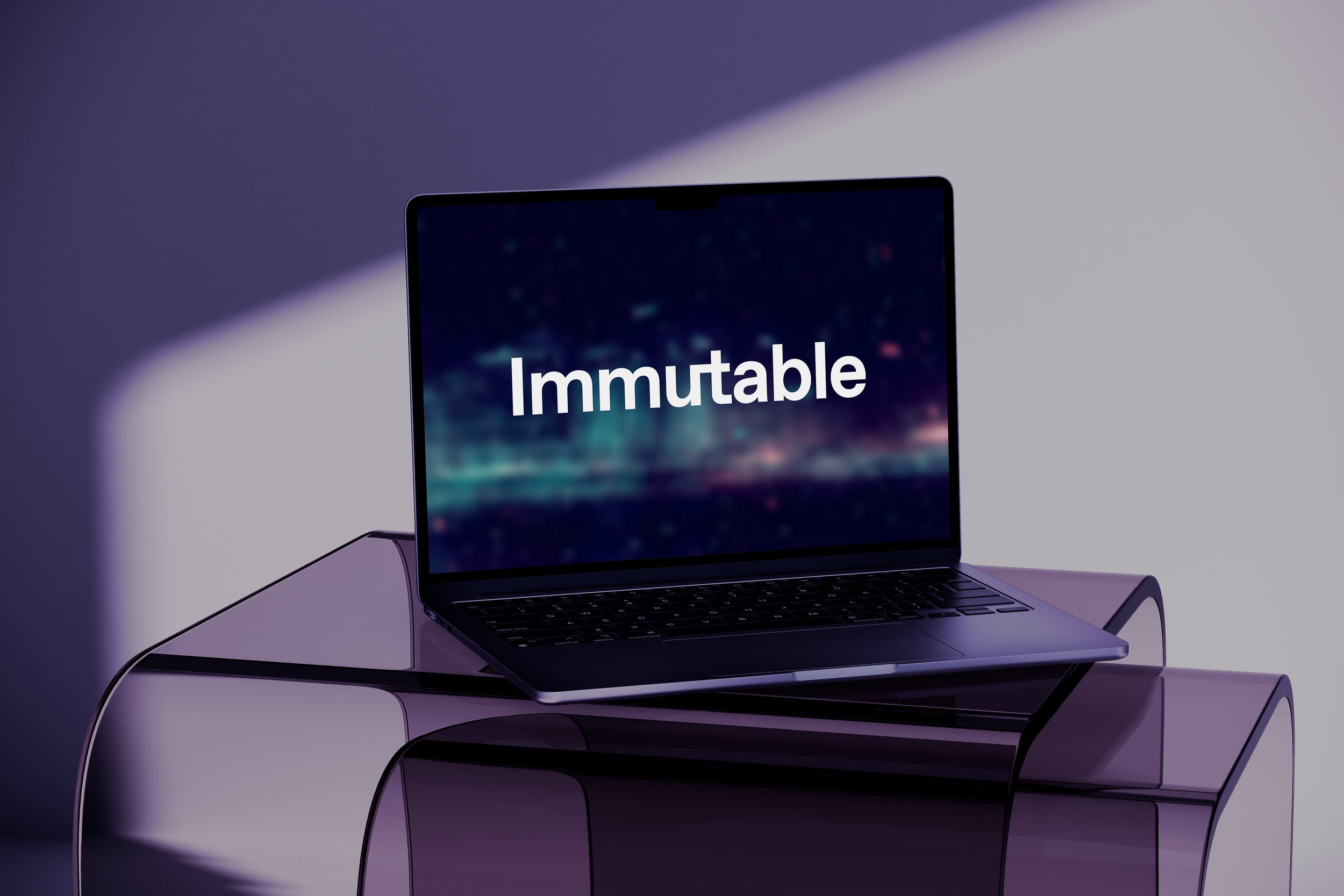
Brand expression & activation: All Internal and External touchpoints such as: Evolution of Master Brand’s Visual Identity, Internal Decks, Pitch/Investor decks, Social media posts, covers, EB activations, campaigns, Brand Guidelines, Website Design for new pages after the rebrand launch, Event collateral from a design perspective.

Project specifics
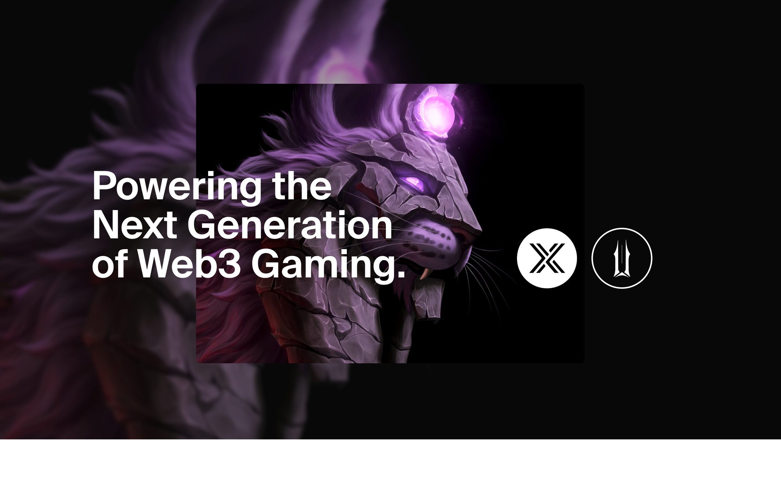
Rebrand Rollout
@ Immutable
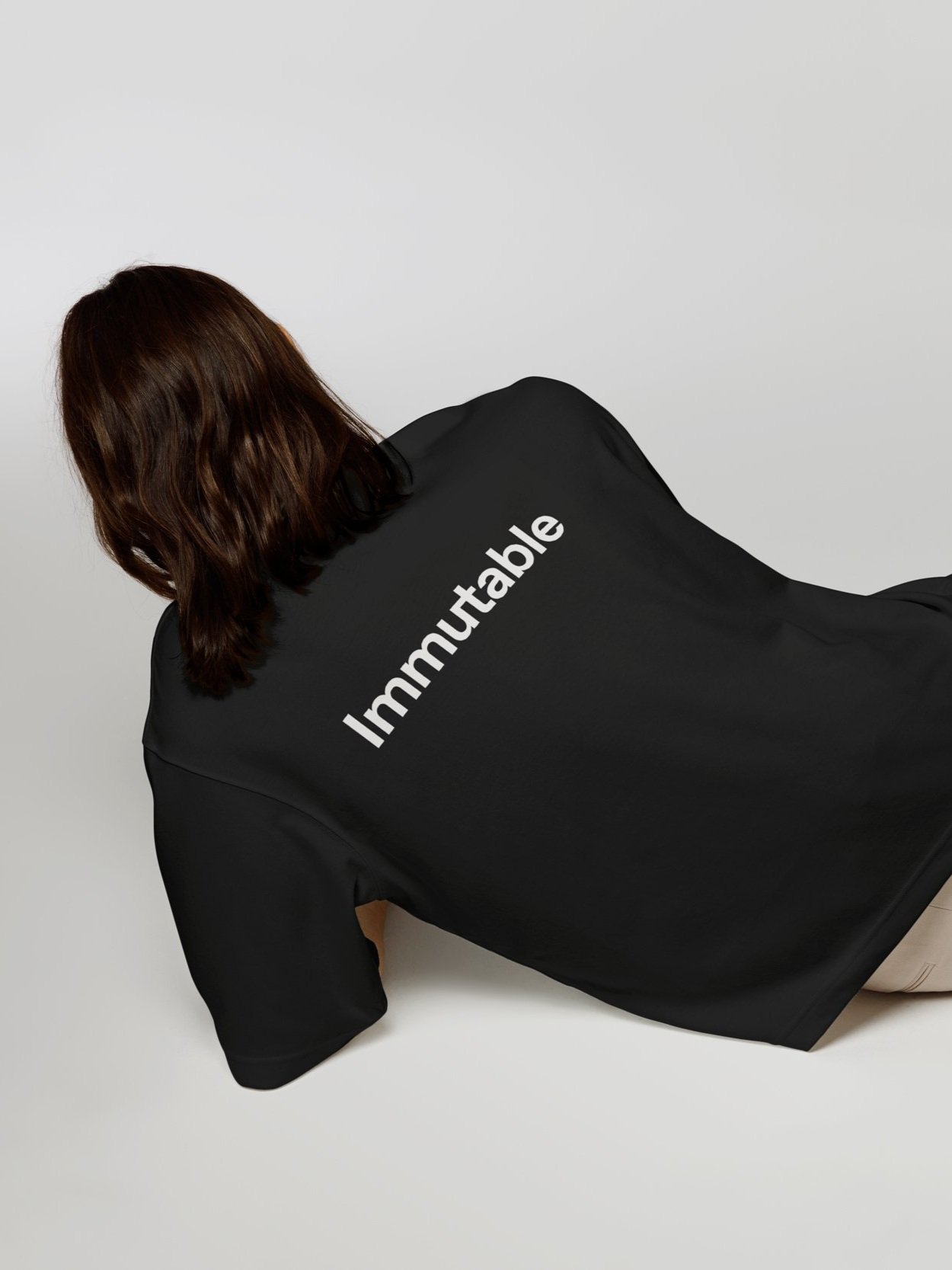
Example of brand and digital asset management
Bringing to life newly rolled out brand and continuing brand evolution
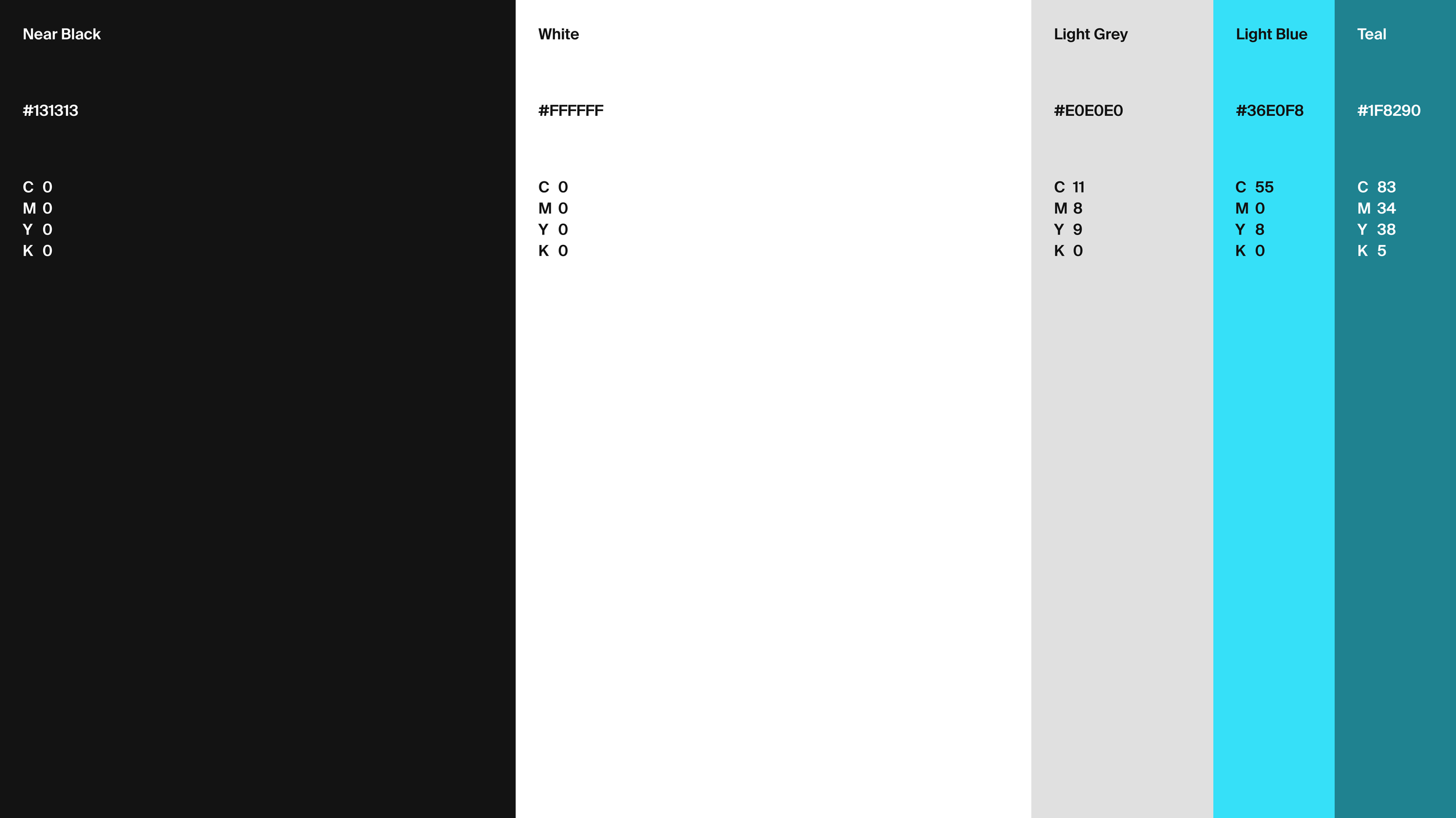
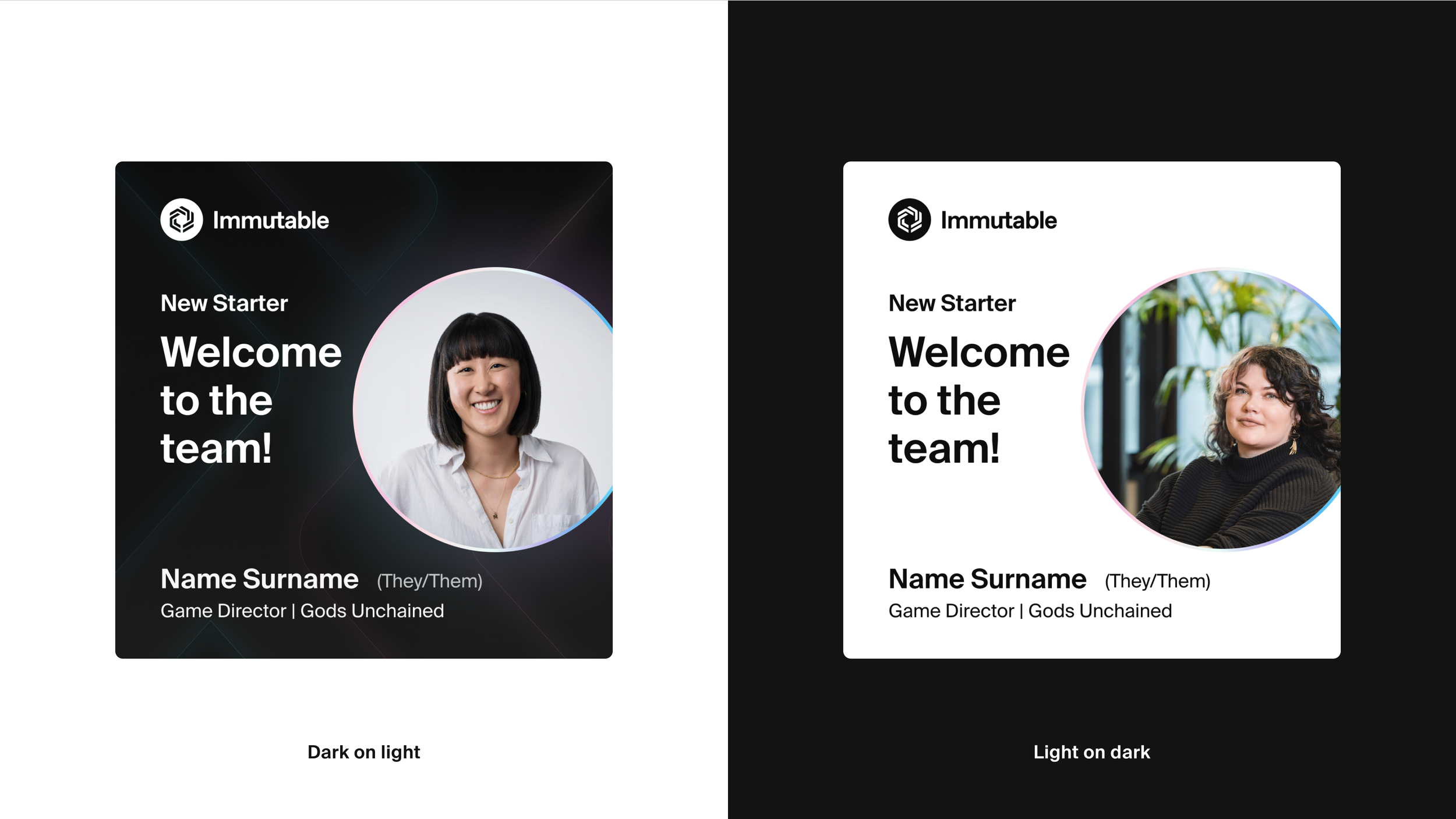
Brand Guidelines | Up-to-date assets | Templates | Product Design
Making Design and brand consistency accessible to all employees
I. Project overview
I joined Immutable as a Sr. Visual Designer and helped various Departments to bring projects to life. With the support of the Marketing lead, and a Design Agency that helped with the Rebrand, I worked on the following items to help with the Rebrand rollout in a very tight timeline:
Templates for Internal Decks, Pitch/Investor decks
Social media post templates, covers for all platforms
Employer Brand activation and campaign templates
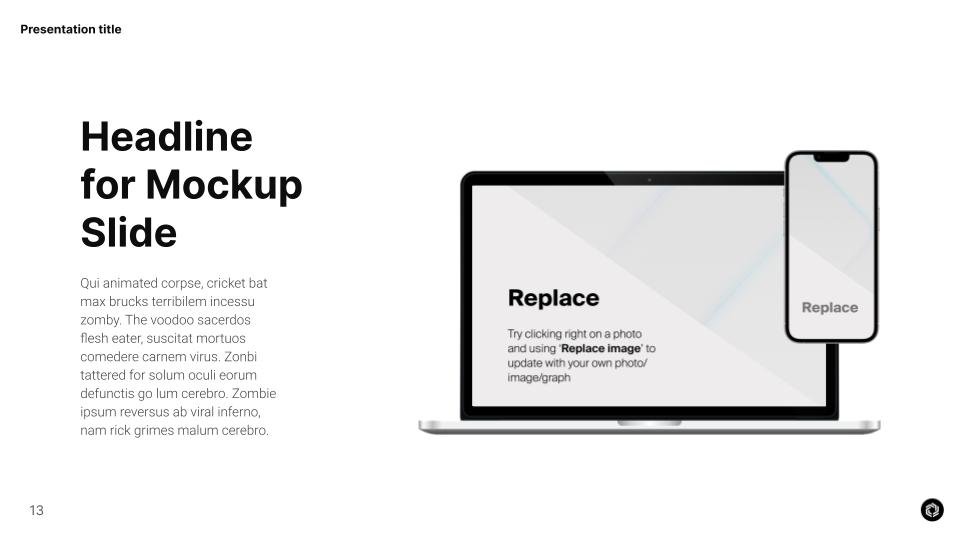
Website Design for Careers, Events and Developers page
Help with final formation of Brand Guidelines
Swag items in digital and print
Storyboarded, co-directed the rebrand teaser video that the video production agency created
Careers page UI Design
Events page UI


II. Process & decision making
During the Rebrand phase & rollout - since I was the only in-house Designer at the time, the point of contact between the agency and Immutable from a design perspective, while working remotely 9 hours behind Sydney - I had to work strategically, async and be a couple steps ahead of the process.
While rolling out all prioritised touchpoints, the Brand Guidelines were still in the making so I had to work on the fly, calibrate and connect the dots between the Creative director’s vision and the company’s expectations under extremely tight deadlines.
I implemented the most practical processes to support the deliverables:
Gained access to every piece of material the Design agency had explored with the company (early drafts, brand definition, workshops etc)
Daily check-ins with the Creative director touching on all fronts
Requested frequent feedback rounds from the main stakeholders
Shifted my working hours to get a better overlap
Real-time access to the Creative director’s WIP
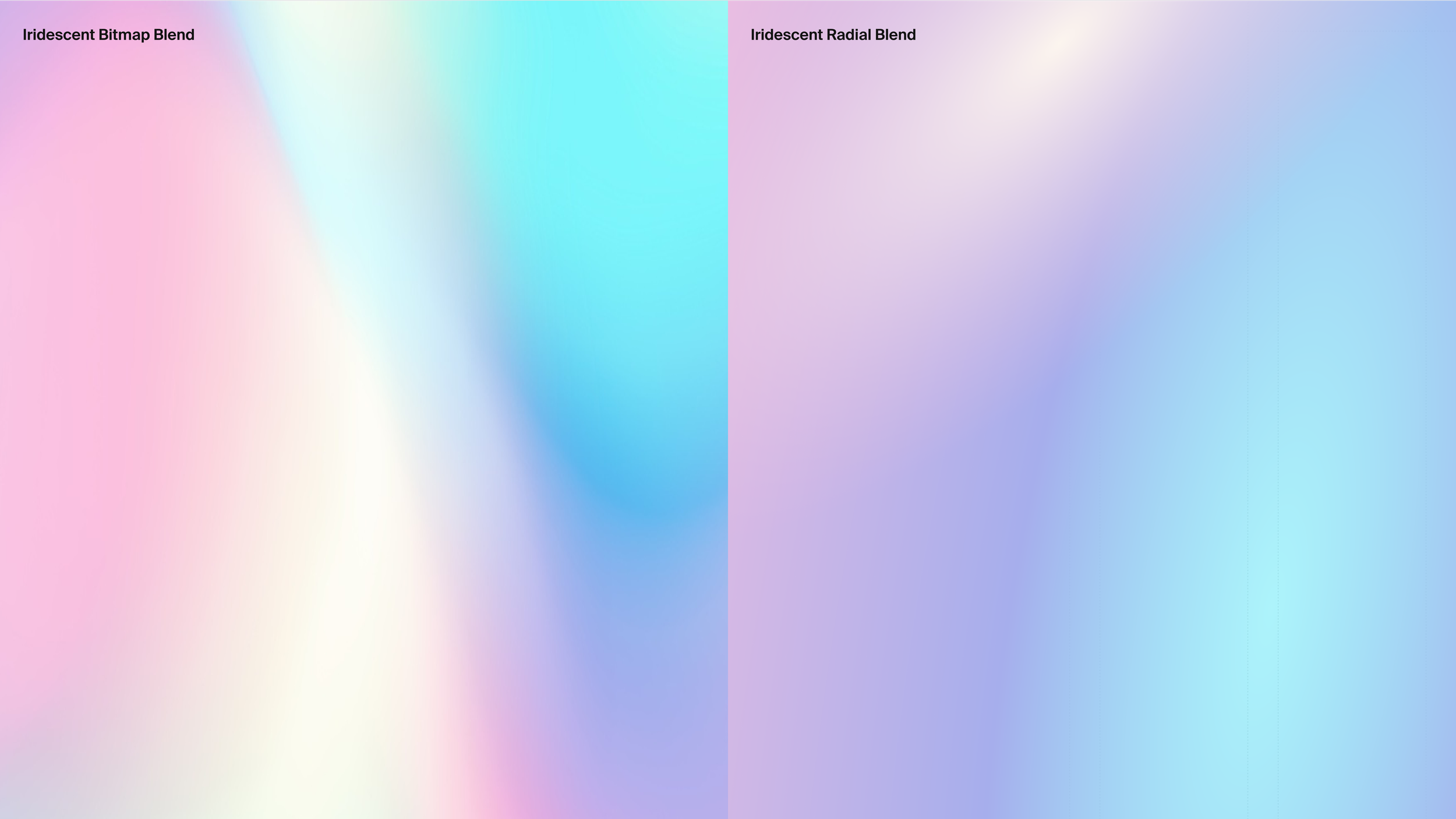
While the agency had developed and fleshed out quite a few touchpoints, bringing me into the mix, gave me the opportunity to influence a lot of the Visual decisions and the look & feel of the Visual identity.
More specifically, my major points were:
Reducing Iridescent blend and making it complementary and discreet
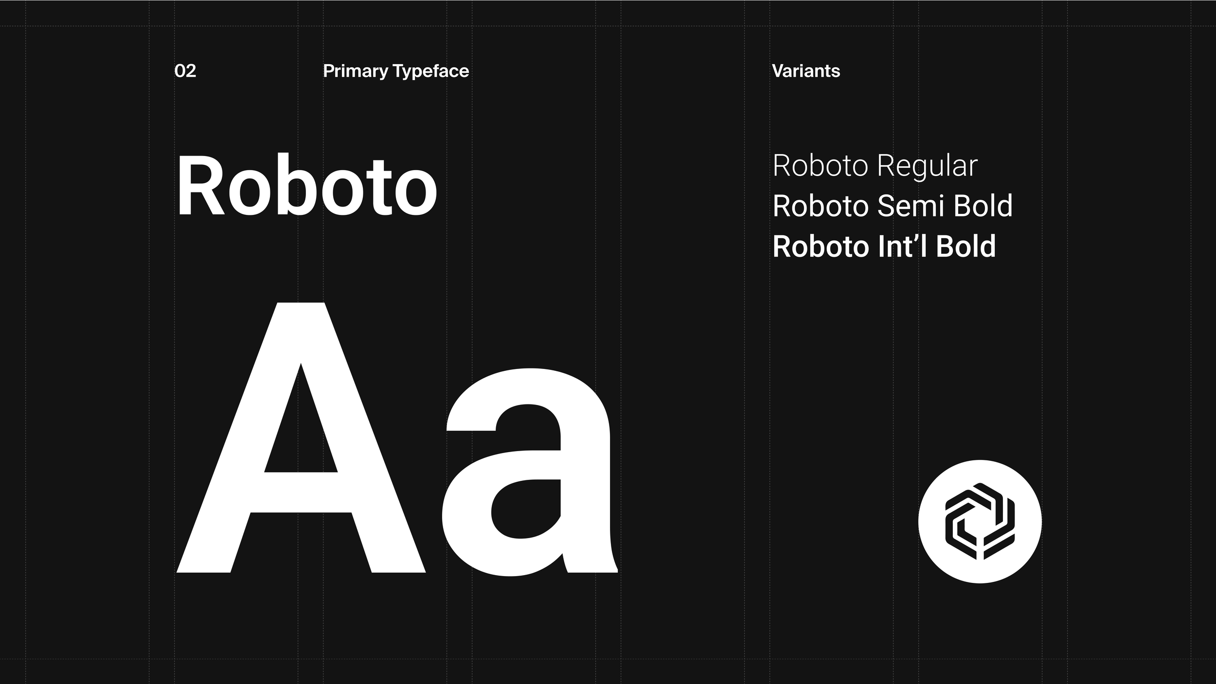
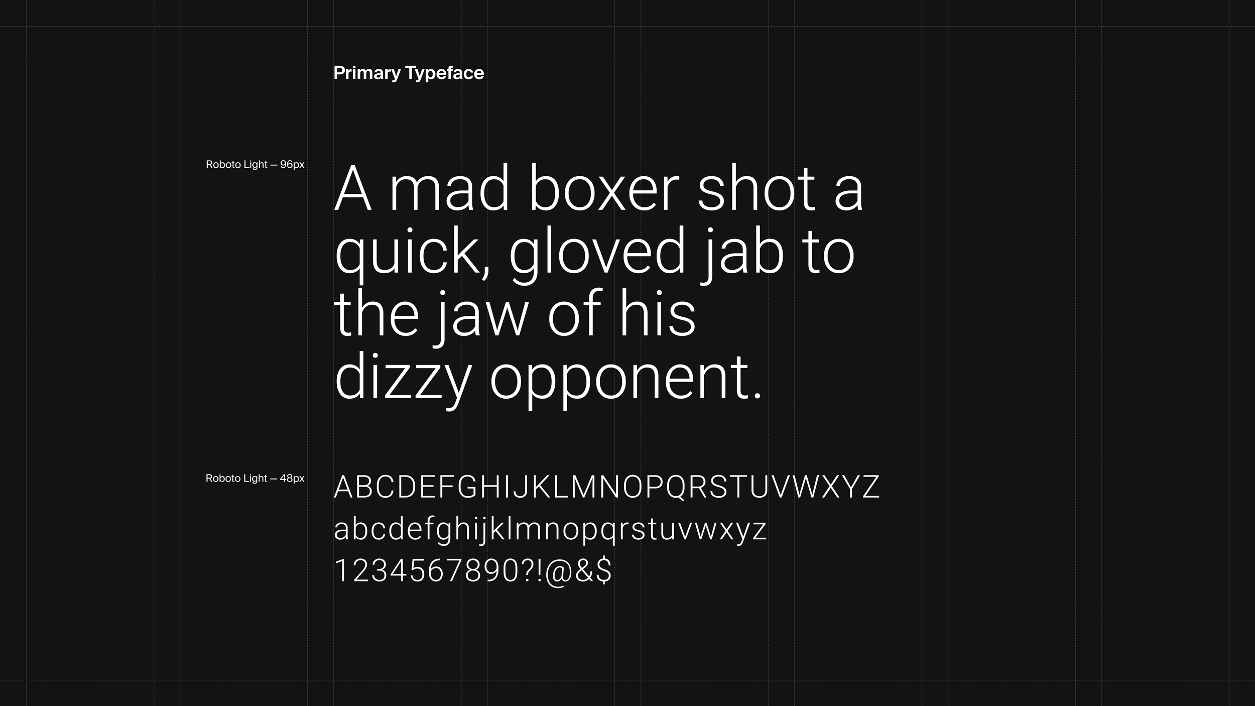
Finding alternative font that is web-friendly and resembles Suisse Int’l
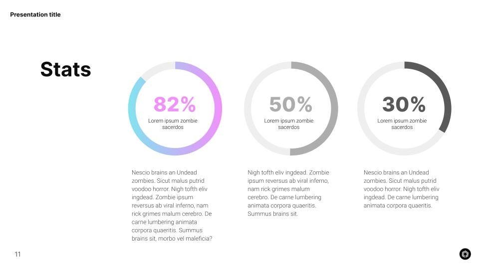
Making the Presentation Deck templates more accessible to all employees with a variety of options

Guidelines


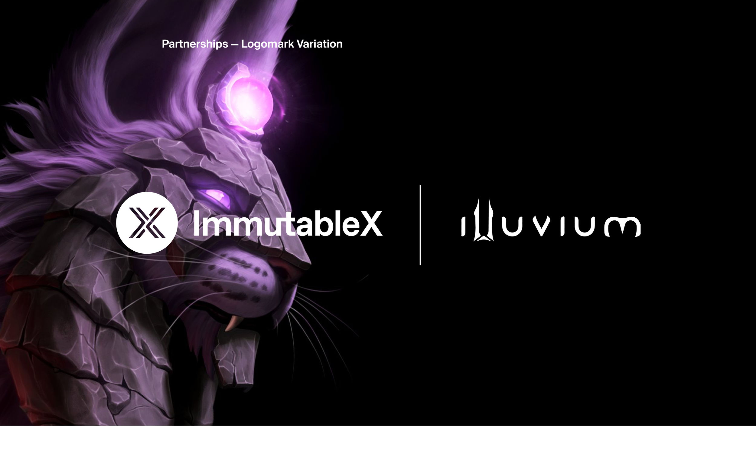
Partnerships


Presentation Templates


SWAG

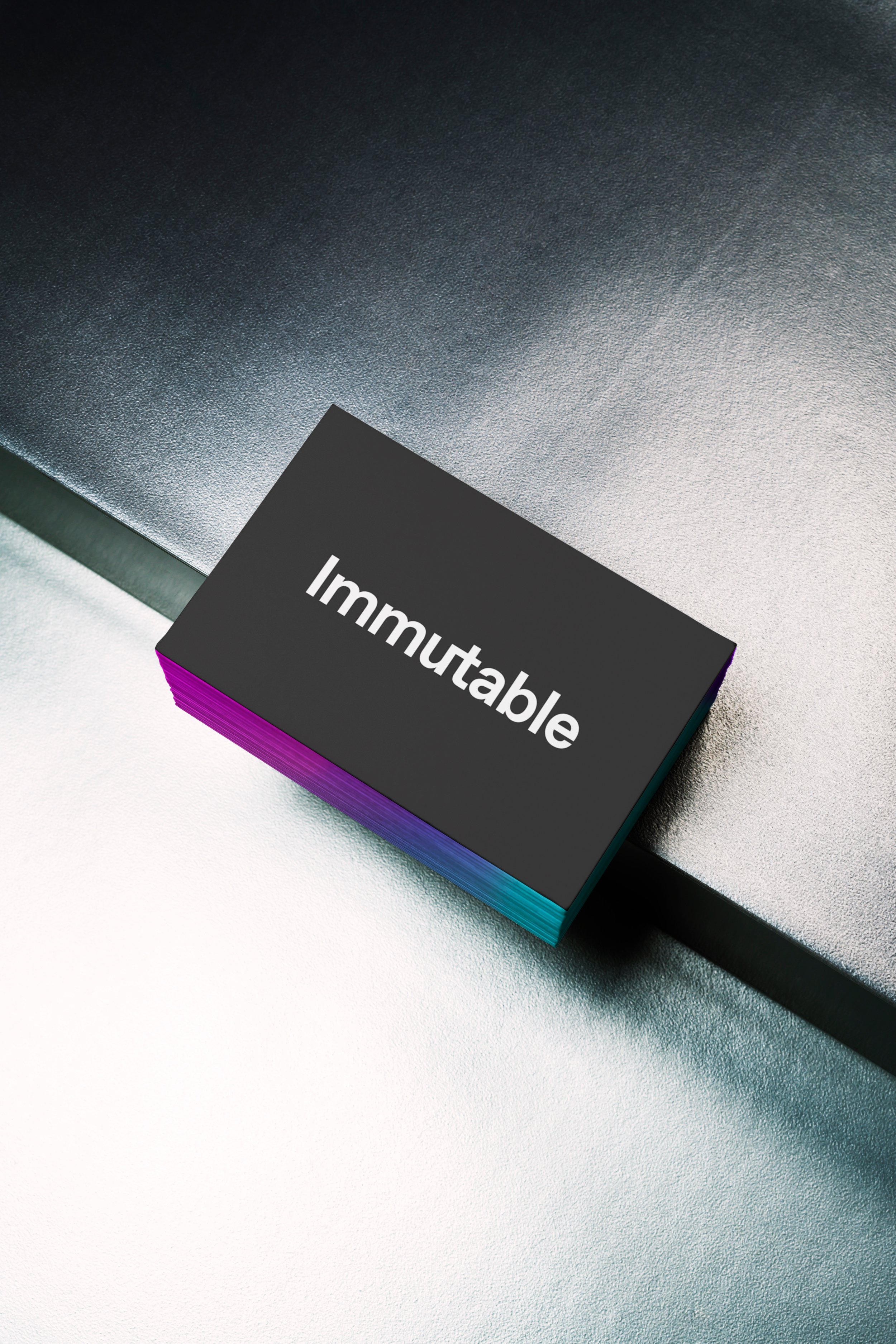

Brand portfolio

Between 2 Layers Pod
Visual Identity for the Podcast
Responsive Covers for all platforms
Developed Visual Language for Thumbnails
Maintained consistency across different episodes/guests


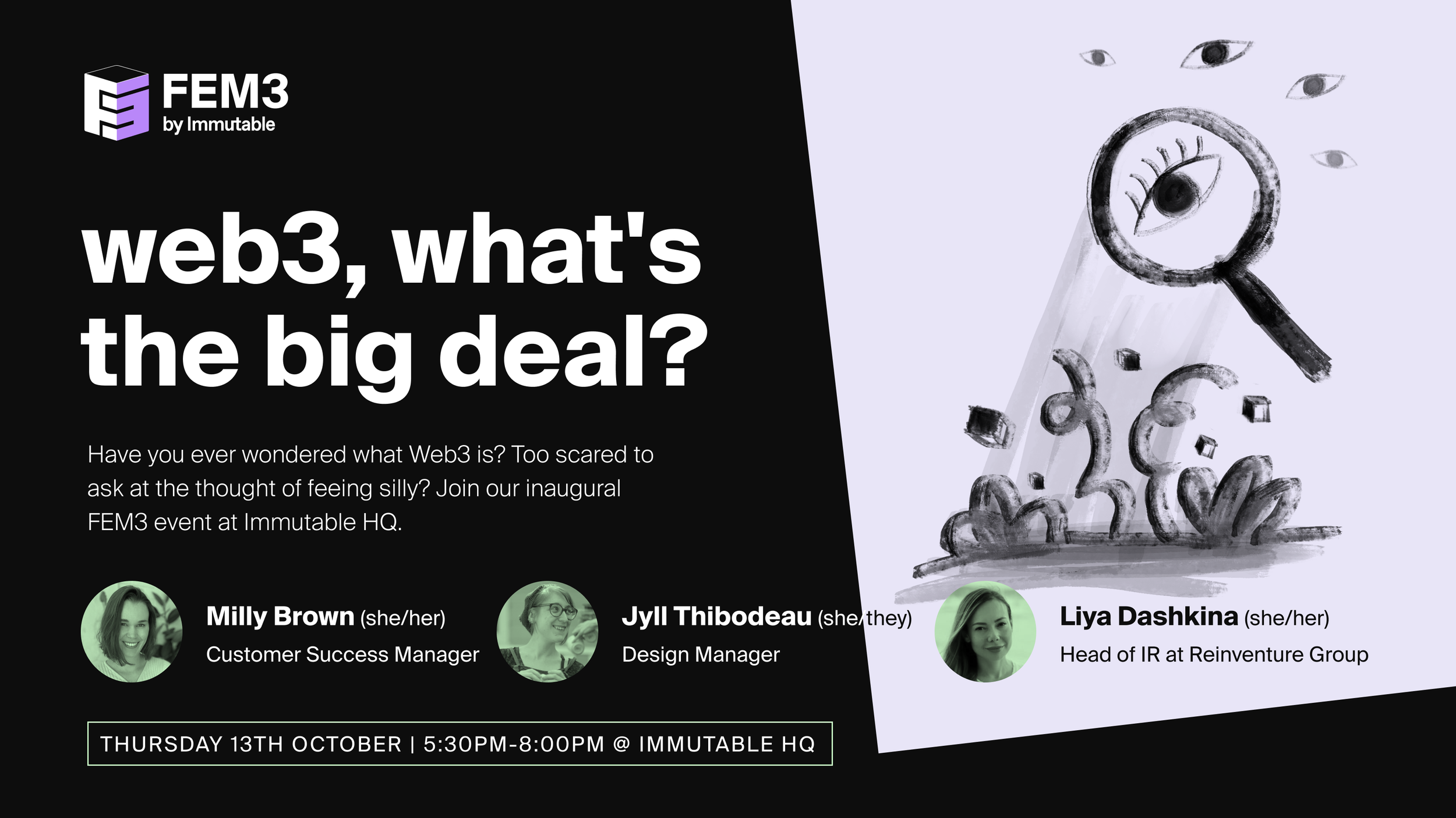
Fem3 group @ Immutable
Visual Identity for the group collateral
Social Media posts
Illustrations for posts and campaigns
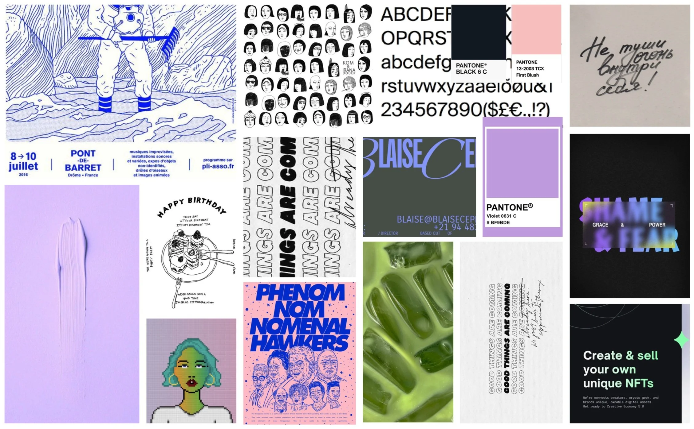
Moodboard

Logo versions